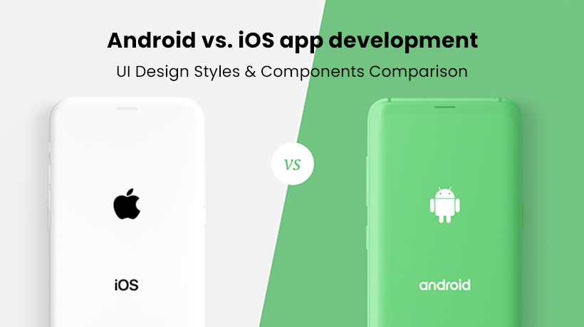
The mobile app market is expanding rapidly with the growing ubiquity of smartphones and mobile devices, along with different types of apps that users can use for various purposes according to their choice. When it comes to mobile app development and design, the market is dominated by and divided between Google’s Android and Apple’s iOS platforms. Expectedly, as the market growth is driving by the continuous expansion of innovative apps, the number of iOS, as well as Android app developers, is also skyrocketing and hitting new heights. Both Apple and Google have their set their own UI styles and design guidelines that should be kept in mind when building an app for a particular platform. These rules define the different aspects of the app product and help design a user-friendly and efficient interface with a refined user experience.
In the development sector, one trend that has gained a lot of traction over the last few years is to develop applications with the same app design and layout that can be used and shared across both Android and iOS. But some inexperienced app developers and designers don’t consider the nitty-gritty details and notice the difference between iOS and Android UI patterns and components, which might confuse the potential users later. To tackle this, they must understand how Android’s Material Design differs from Apple’s Human Interface guidelines. In this article, we will explain and compare Android app development to the iOS app development based on UI design elements and its patterns.
Component #1: Tap Target Size.
In Android designs, the minimum tap target size for any element on an app should be 48x48dp, and for the iOS platform, the minimum size is set to 44x44pt. One point to note here is that DP (device-independent Pixels) and PT (points) are functionally equivalent.
iOS platform – 44x44pt
Android platform – 48x48dp
Component #2: App Icon Size
An app icon is an essential part of your app as it plays for communicating and illustrating a constructive visual impression and identity of your brand while reflecting your app’s function. Your app’s icon is more than a UI design component; it’s a starting point that generates interest, sets the quality of your product, and creates a smooth path for users to get acquainted with your brand. An expertly-drawn icon with distinctness and precision can mean the difference in account of your app’s usability as well as installation and brand representation and reputation. The icon size and shape for Android and iOS differ on the basis of the device type and where it’s used.
App Icon Size: Android vs. iOS
In Android, an icon can be created in different sizes ranging from 48×48px to 512×512px.
Similarly, in iOS, icons are created and used in various sizes too from 29×29px to 1024x1024px.
When creating an app icon for Google Play Store, keep its size large and design it at 512×512 pixels, and for App Store, design it at 1024×1024 pixels.
- Google Play Store (App Icon Size): 512x512px
- App Store (Icon Size): 1024x1024px
Component #3: App Icon Shape: Android vs. iOS
App Icon Shape: iOS
All iOS icons share the same shape and style – a square with a rounded corner. The main object you choose for your icon is placed within a large circle and created square-shaped. Later, the system automatically rounds-off the icon’s corners. In iOS, the icons can’t be created with a transparent background and non-essential elements like interface elements and unnecessary words, rather they use a flattened but detailed image with a simple background, as per Apple’s Human Interaction guidelines. While an icon should be simple and friendly with a focus on increasing recognizability, that should not restrict designers to create a specified, detailed one with fine points.
App Icon Shape: Android
Following the Android’s material guidelines, when creating app icons for different android home screens, the designers are allowed to use a transparent background, consistent shadows, and range of colors with subtle, appropriate highlights. These guidelines are, of course, suggest recommendations and offer many choices, so designers can work around the icon design as per their product requirements. While the guidelines are not strict rules but following them every now and then can be beneficial to give your icons a consistent and cleaner look and feel. You can choose and go with any shape, like diagonal, rectangle, square, circle, whichever works perfectly with the icon area and allows the flexible (but steady) adjustment and fitting of visual elements.
Similarly, an app icon for the Play Store should be designed in a way so that it can attract people’s attention and help your app stand out in the store. Not too long ago, the store vouched for a new specification in the icon design. Similarly to the App Store, the Google Play Store also switched from the freeform icon design to uniformed rounded square shape icons. The focus here is to make the icon visually more appealing and recognizable while maintaining and illustrating consistent graphic proportions.
Component #4: Buttons: iOS UI Design vs. Android UI Design
Buttons play an essential part in the navigation and UX/UI design, whether you are engaged with android app development or iOS app development.
4a – Back Button: Android vs. iOS UI Design
On account of style, functionality & design, one key difference between iOS and android is the Back button.
In Android, the back button is highly-familiar and placed at the bottom navigation bar, allowing the user to return to the previous page or screen easily.
In iOS, a global navigation bar, with a back button, doesn’t exist in the native iOS mobile app design that impacts on user interactions and overall interface design of an iOS app. For this reason, most apps on iOS come with a back button (or icon) on the top left side of the screen.
4b – Action Button: iOS vs. Android UI Design
Another difference between them is ‘Action Button ’that enables the user to perform specific tasks and navigate as well as take actions on your app with a single click.
In Android, this button is called Floating Action Button (FAB) and used in different areas of the interface. FAB is usually known as the primary button of a page and represents the most critical actions of an app. Floating action buttons might also refer to higher priority and have more visibility than other buttons or navigation components.
In iOS, the analogous primary action button is “Call-To-Action” button that offers similar functionalities and capabilities as FAB and can be placed anywhere around the main content.
For instance, the ‘Tweet’ button on Twitter acts as a floating action button that incites the user to take action. In the android version, the ‘Tweet’ FAB can be seen floating on the right side of the bottom, and on its iOS counterpart, it is located on the top of the screen over the title bar.
Component #5: Menu and Settings: Android vs. iOS
In terms of app settings and navigation menu, both Android and iOS platforms have a different approach. Most Android apps usually utilize the hamburger menu with a list of options to click on and navigate throughout your app. It gives users direct navigational access and allows them to switch from one page or category to another page or category with a single quick.
While most iOS apps follow the bottom tab approach in which a tabbed menu is set at the bottom of the screen but without the labels, iOS devices and apps that support 3D Touch might use context menu that enables on-page UI without cluttering the interface.
Component #6: Typography: Android vs. iOS UI Design
6a – Font Type: Android vs. iOS (Recommended)
Both Android and iOS have documented its own default fonts:
- San Francisco font for iOS app design
- Roboto for Android app design
While both systems recommend using the mentioned fonts in an app UI design, designers are allowed to experiment and use fonts that are appropriate, readable, and easy-to-understand. The fonts you use for your iOS or Android app development project should offer a native look and feel and create a sense of consistency. To give an app an artsy and decorative look, some inexperienced designers use fonts, like Franklin Gothic or Algerian, but end up making their entire design and interface worst.
6b – Font Size: Android vs. iOS UI Design
Concerning the point size, designers can select from different styles and sizes based on their product and the priority of the content. For instance, the content for the H1 header can use the font size of 96 as it holds the introductory, highest priority information.
Both Android’s material guidelines and Apple’s Human Interface guidelines support the larger accessibility text sizes and a range of contrasting system fonts. Designers can set and choose the size, weight, sentence space, and other typography factors that work best for their app design. The focus should be on facilitating readability and providing your potential users with a comfortable and smooth reading experience on your app.
Component #7: Search Bar: Android vs. iOS app development
The search bar on both Android and iOS is almost similar when it comes to design, functionality, and structural interface. In iOS as well as Android apps, the search bar is placed in the upper tab to perform queries without interference. Sometimes in an iOS app, the search bar is hidden and needs to reveal it by dragging the top of the screen towards the down. In Android design, this tab is not hidden and can be spotted easily.
The only difference between the Android search bar and the iOS search bar is ‘cancel’ functionality. In iOS apps, a query is canceled by clicking on the ‘Cancel’ button while an android app uses the ‘Back Arrow’ to cancel the search mode.
To clear out any existing query on iOS and Android, just click on X.
Component #8: Cards: Android vs. iOS app design
Cards serve as innovative rectangular-shaped entry points to display detailed information in less space. In iOS and android design, these cards are designed, used, and displayed differently, on the account of format, design, and other UI elements. These cards are not restricted to only include a collection of data, text, and images and can also display comments, audio libraries, buttons, videos, and other UI elements.
In iOS, cards are designed with a flat and simple look with a full-width, clear rectangular box.
- Full-width
- Rectangular box
- No round corners
- A slight or no shadow
In Android, cards are designed with different features like sharply defined margins and gutter.
- Defined shadows
- Defined margins
- Round Corners
- Gutter